Group 1 - Study Assignment Tracking and Support Platform
Contents
Project Description
From the very beginning, our team wanted to focus on an app or a platform that would help students with their assignments and schoolwork.
We aimed to create an online platform for students that would aid their planning and work on university assignments and projects. Our idea was that this could be achieved through a tracking and reward system, while also focusing on psychological aspects like motivation and anti-procrastination.
Contextual Inquiry
During the Contextual Inquiry, we tried to find out how people interact with apps or tools similar to the one we aimed to create, what tools and processes they use for their assignments tracking and planning, and what they would want but is missing on the market.
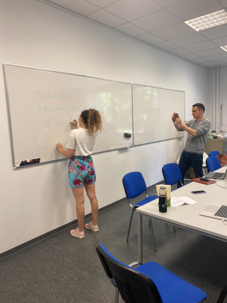
We brainstormed ideas in order to create an online survey, interview questions, and a simulation with a whiteboard tool, which would constitute the different parts of our Contextual Inquiry. This process would allow us to get more information about what platforms students currently use and why they use them, as well as their typical approach to assignment work. The interview and the simulation were done together so that each interview took around 30-45 minutes.
Survey
Aim: We wanted to understand whether people use online or analogue tools, and which techniques they use the most when it comes to assignment planning
- Online survey
- 3 main questions
- Sent to as many students as possible
- Focus on finding most popular tools and approaches
Results:
• 64 responses
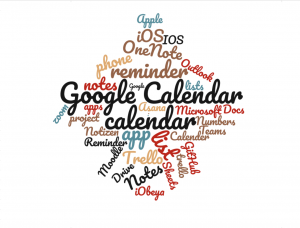
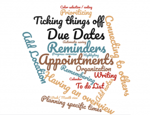
• 32 (50%) do not use organizational apps for university work
• 31 (49%) use organizational apps for university work
• Most used digital platform: Calendar
• Most important feature: Reminders
• Recurrent analogue technique: paper and notebook
Interview
Aim: We wanted to get deeper insights into how people are using their tools to plan and track their University assignments
- Online virtual call or in-person
- Open-ended prompting questions
- 5 participants (all current University students, via. opportunity sampling)
- Focus on current ways of working
Simulation
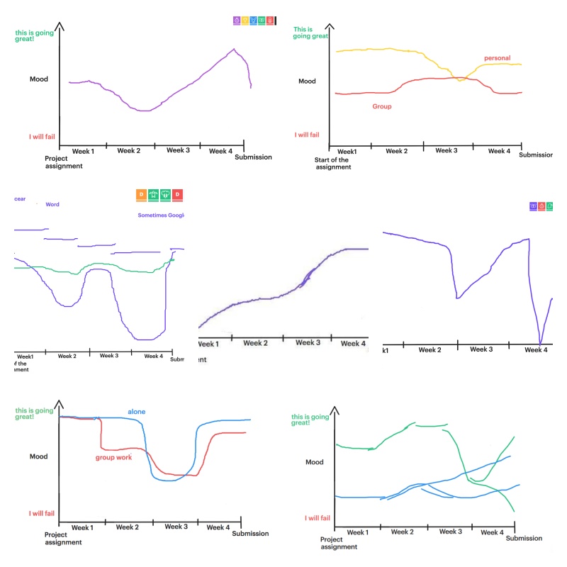
Aim: We wanted to understand what struggles students frequently face when working on their assignments (e.g. emotional, time management, etc.) and which coping techniques they use
- Online virtual call or in-person
- Step-by-step walkthrough of their process and their organizational plan
- Weekly play-by-play including their mood and progress
- Open-ended prompting questions
- Same participants as in the Interview section
- Focus on steps people would take in an assignment situation
Results: Interview + Simulation
Interviews were analyzed through a color-coding procedure based on the following categories:
1. Tools
2. Features
3. Strategies
4. Problems
5. Coping & Support
6. Motivation
After the aforementioned procedure was concluded, the following ideas were the most recurrent for each theme:
1. Tools: Documents
2. Features: Having an overview/timeline
3. Strategies: Planning / prioritize tasks / overview / schedule To-do's / splitting up tasks / different plannings for different To-do's
4. Problems: Procrastination
5. Coping & Support: Practical support by other students, tutors, teachers
6. Motivation: Timekeeping / Classmates & teachers
Simulation Graphs:
Personas
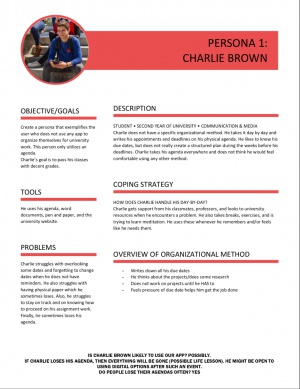
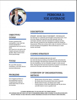
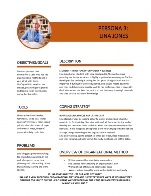
To understand the different types of users that would interact with our app, we built three personas. These personas were based on our findings in the contextual inquiry and represent typical student work ethics when it comes to assignment work. They showcase the procrastinator, the average student and the high achieving student exemplars.
Scenarios
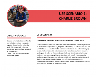
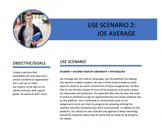
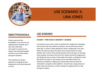
To understand how the different types of typical users would approach and interact with our tool, we created three case scenarios centered around the before mentioned personas. The scenarios illustrate how each student typically works on an assignment and how they would implement our platform in their process.
Focus Group
Purpose & Objectives
The objective of our focus groups was to gather information about how students approach university-related projects and track their progress. Also, we wanted to gain insights about what are some of the major things that hold them back (e.g. procrastination, not enough time, no structure, etc.) and what helps them in achieving their project goals.
During the focus groups, we utilized the Disney method and also had participants evaluate our previously generated ideas and goals. This step really helped us refine our initial ideas and narrow our scope.
Participants
We had two sessions of focus group interviews, detailed below:
1. Focus Group Interview:
Moderator: 2
Observer: 3
Participants: 7
Duration: 1h
Age: 20-25
Gender: 1 Man and 6 Women
2. Focus Group Interview:
Moderator: 2
Observer: 2
Participants:  5
Duration: 1h 10min
Age: 20-25
Gender: 5 Women
Procedure & Activities
For both our focus group sessions, two group members took on the role of the moderators, while the remaining three acted as observers took notes. The procedure was split into three different parts:
I. Part: INTRODUCTION
- Quick Introduction to our project
- Icebreaker and small discussion to get to know each other
II. Part: DISNEY METHOD
For the activity portion, the Disney Method was utilized, requiring participants to take on different roles. The participants were asked to brainstorm ideas in various steps following four different, subsequent phases. They were the following:
Outsider Phase
- In this first phase, we asked the participants to think individually about their past experiences with assignments, to remember their struggles but also the things that kept them motivated and made them feel supported. Further, they were asked to reflect on how their work and thought process during assignment work usually looks like. Here, we did not ask them to share their thoughts with us, since it was rather tough to make them reflect on their usual behaviour and needs during assignment work. Rather the aim was to get them in the mindset and give them a feeling of what this activity will be about.
For each of the following phases, the participants first thought about their ideas individually and then were asked to add their thoughts on an empty Google Slides Presentation which we provided. Each round was followed a group discussion, moderated by one of us.
Dreamers Phase
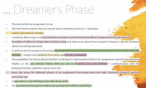
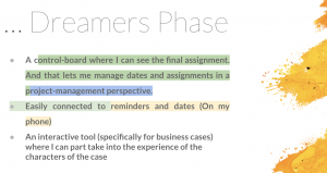
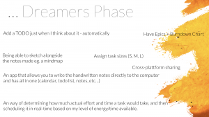
- In this phase, the participants took on the role of a dreamer. We asked them to think bold and outside the box and come up with ideas that were not limited by what is feasibly possible. They were asked to think about what would be the best possible tool to help them with their assignments.
- During the group discussion, one of the observers summarised the participants'ideas into keywords
- Keywords used by participants were copied onto the slide of the next phase so that they could be built upon in subsequent stages.
Realist Phase
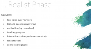
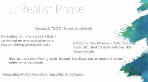
- Taking on the role of the realist, the participants were asked to assess the ideas from the first phase, from a more realistic point of view. They discussed if and how the ideas could actually be realised and what the process would require.
- Keywords from the Dreamers phase served as a structure to assess the ideas from earlier more realistically.
Critics Phase
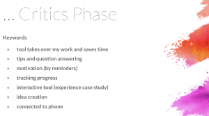
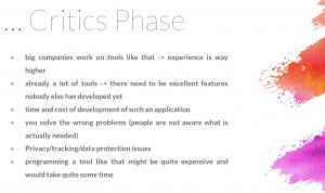
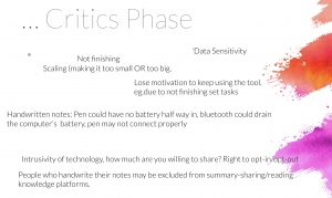
- In this last phase, the ideas participants were working on were discussed critically. They were asked to consider what could possibly go wrong, and what doubts they had about their previous ideas.
III. Part: REFLECTING ON EARLIER FINDINGS
In this part of the Focus Group, participants were presented our previous findings and conceptualizations and asked to generally reflect on them. They were also introduced to the four common themes found in our earlier research:
- Procrastination
- Organisational support
- Writing support
- Scheduling/time-keeping
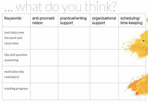
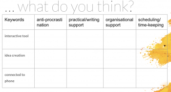
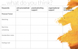
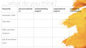
This quick summary was followed by the second activity. The second activity consisted of the participants connecting their own ideas, in forms of the keywords they were utilizing in during the Disney Method exercise, with our four themes. For this purpose, we again provided a Google Slide with a table, including both keywords and themes, and asked them to fill it out and discuss it afterwards.
Findings
Most common themes:
• Procrastination
• Organizational support
• Writing support
• Scheduling/ time-keeping
• Communication
Following is the summary of the ideas developed by our focus groups participants, and how those ideas were elaborated through their development phase, problem analysis phase, and their resolution phase, which were part of the discussion about their ideas both throughout and after the Disney Method exercise.
AUTOMATIC TO DO
- Development: Tool that reads your mind; speech to text tool; reminders; an anti-procrastination reminder
- Problem: Lose motivation to keep using the tool; reminders are not useful after a while; people who handwrite things are excluded
- Resolution: Reminders can work for anti-procrastination reminder & practical/writing support & scheduling/time keeping; possible reminders (not invasive) about the work you need to complete
TASK SIZES & EFFORT AND TIME MEASURE
- Development: Tool that tells you exactly how big an assignment is (S, M, L); time and effort measure; pre-calculated database with temporal data
- Problem: Might not be actually measuring correctly, incorrect calculations cause you to not finish on time; exclusion of people who are analog; loss of motivation
- Resolution: Task sizes, effort and time measure can help with anti-procrastination, practical/writing support, scheduling/timekeeping; can give you an overview of what you need to do
EPICS + PICS + BURNDOWN CHART
- Development: Have a whole chart that tells you exactly how everything works; this chart could include handwritten notes and be cross-platform (Tablet Notes, GitHub)
- Problem: How much are you willing to share with technology?; data motivation; handwritten notes issues (battery & pen issues with connection or battery)
- Resolution: This burndown chart can help with anti-procrastination, organizational support, and scheduling/timekeeping; can be an option for people who are willing to utilize it
SKETCHING
- Development: Write down your notes on paper, and be able to take a picture with the app transferring them immediately to a digital format; use a digital pen and other possible programs that are not only for IPads; possibility to incorporate creation of mindmaps
- Problems: Things can run out of battery; digital pen may have issues with connection or lose battery halfway through your notes; program glitches
- Resolution: This tool can be helpful for practical writing support, organizational support, and scheduling/timekeeping; possible inclusion of people who like to write things down
REAL-TIME SCHEDULING
- Development: Scheduling things depending on how one feels/energy/time available
- Problems: Data protection; intrusion in a person’s personal life
- Resolution: Differentiating between task sizes and possible effort and time measures
HANDWRITTEN NOTES
- Was discussed alongside sketching
FEELINGS TOOL
- Development: Tool knows exactly how I feel; you can get an overall idea of how you feel when doing a task and finishing it
- Problem: Invasion of privacy; issues with GDPR
- Resolution: You can write down at the end of an assignment how good/bad you feel in order to help you for next time; can help with procrastination
PERSONAL TRAINER
- This would involve indication of task sizes, the prediction of needed effort and time needed to spend, as well as an automatic generation of To-dos.
CROSS PLATFORM SHARING
- Development: Share everything with other students and professors in order to compare keywords and info; just share keywords from other people’s work in order to know what is important for the assignment and what you should be focusing on
- Problem: Invasion of privacy and information about other people’s work
- Resolution: Cross-platform sharing can help with organizational support and practical / writing support
COMMUNICATION
- Development: Communicate with other students quickly and in real-time in order to minimize the need to use other tools when organizing teamwork
- Problem: Invasion of privacy and the availability of other identical communication tools
- Resolution: Include a messenger-style tool in the application in order for students to communicate and create groups
Use Cases
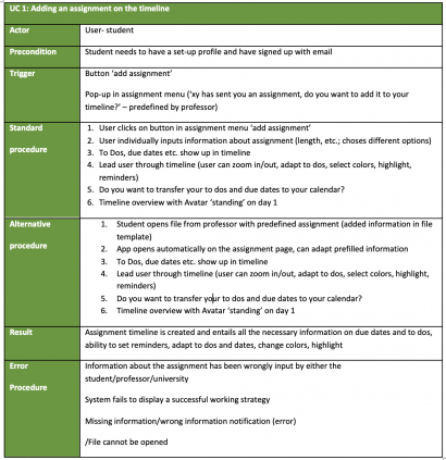
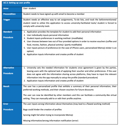
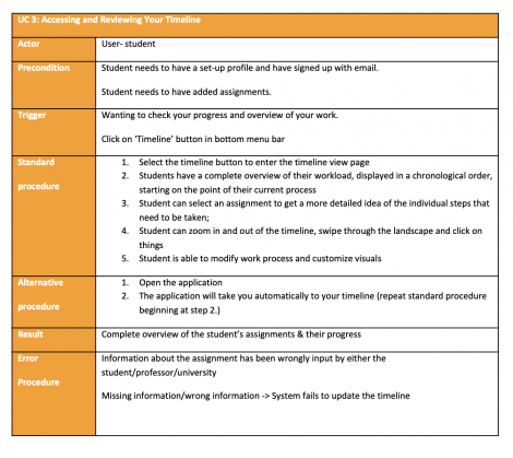
Based on the findings of our focus groups, we picked three use scenarios that would be important for interacting with our application. These use cases illustrated the main interactions our users would have with our platform.
Development of Ideas
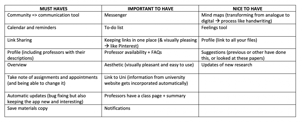
On the basis of the focus group discussions and results, as well as the contextual inquiry findings, a draft of a possible table of requirements when pertaining to our application was created.
Based on these requirements, we were able to categorize our ideas and draft two application ideas centred around two different themes of functions:
Idea 1: Study Community
- Our "ideal world" organizational application consists of profiles for professors, students, and different courses, where each university would be able to create their own virtual environment. Such profiles would include a FAQ for professors, where students could obtain quick answers to their questions. Also, profiles for professors could include a link to their availability dates where students could book meetings with professors automatically, without the need to send emails back and forth. This LinkedIn-like application would also include a feed where students and professors could share interesting articles, tips & tricks and the latest information about university topics. Moreover, a communication tool would be implemented in order for students/teachers to virtually interact and create groups in order to facilitate projects and overall communication. In addition, the inclusion of a calendar as a tool would allow students to sync their classes with added reminders. The calendar would also allow for students to add their assignments and daily To-do lists, with the added bonus of having the option of the software accommodating working times to students' individual needs. The software would give recommendations on how to plan the time spent working on an assignment in order to finish by the due date.
Idea 2: Work Organization
- Our second "ideal world" application would consist of an anti-procrastination planning tool. This application would include tools that would help students get organized to be up to date with their classes and to receive feedback from professors without having to plan unnecessary meetings. In addition, this application would allow for both students and teachers to have a profile, where professors could include FAQ and availability times for students to utilize in order to set meetings. Such aid would allow both students and teachers to skip the constant emailing to set appointments. Furthermore, the tracking of assignments could provide benefits and rewards for students. For example, once the assignment is finished, the student could receive a 20% discount in a café around Berlin.
Based on this analysis, we choose to narrow down and focus on the second possible application, the assignment planning and anti-procrastination app.
Similarly, since the second idea was more in line what our initial project was centred around, we decided to focus on it further. As the idea of what we were trying to achieve became more refined, the functions of our main application were also narrowed down to the following:
- Reminders
- To-do lists
- Dates / due date
- Customized tracking tool for working on assignments. You input the type of assignment you are working on, length, how long you have to work on and your working style, and it can create a working timeframe and timeline. Similar to a habit tracker or productivity trackers, but it can generate the timeline for you, and give you notifications about the goals you should be working on daily or weekly.
- Profile set up where you specify preferences, on your working style, surroundings you prefer, rewards you prefer
- A reward system for work done, where we partner with nearby cafes and retailers and give the users perks and benefits that motivate them to work and interact with the app more
Edited Requirements
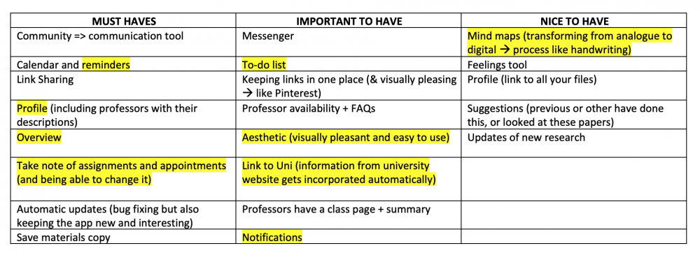
During our brainstorming sessions, we started narrowing down the features from the requirements list that our application would feasibly include. Most of these decisions were based on how well the features aligned with our new goals and concepts.
Based on the fact that we choose to focus on the second app concept, the following highlighted needs from our initial requirements table were selected to focus on in future exploration and implementation of our project:
- The Calendar feature, for example, was now taken out completely because we decided to work with a new timeline feature as a way of interacting with and planning of assignment work. The feature seemed redundant in the scope of our app, and we found it more user friendly to have the ability to synchronize the work they do within our app. Since our users indicated that they do not want too many interactions and options, we did not feel the need to keep the calendar, as dates and due dates would also be viewable in the timeline that our app was now centred around.
- The messenger and community platform features were also removed because they better fit with the functionality of the first application idea which the group did not decide to focus on.
- Link sharing and feedback options were also taken out, as our app was no longer to be a collaboration and working together tool anymore.
- Academic / Research resources were also taken out of our final concept since users indicated that this would not be helpful to actually work on the assignment and since the application was refined to focus more on helping students organize their work and structure their time.
- Professor pages + contact + availability
And so, StudyFuel was born …
StudyFuel
Final Project Idea:
- StudyFuel aims to provide a space where people have a timeframe of their work, and where they can easily visualize and interact with their planning and progress. With the implementation of rewards for task and goals completed, the app aims to further help keep people motivated and on track.
- In the end, the main function of our app was to be the timeline and progress tracking function, which we aimed to innovate and make as user friendly as possible.
Prototype Planning
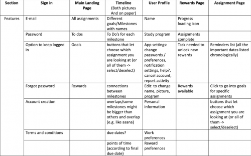
We started our prototyping process by defining the requirements for our prototype in a table. Therefore, we used our findings from the contextual inquiry.
We derived the requirements for our prototype as we thought about the information it should deliver and how we would want to present them, the functions it should have, options for data exchange, and if there are any other special requirements we would need to include.
SKETCHES
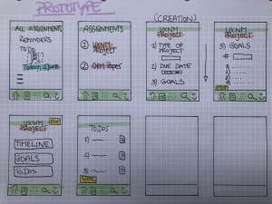
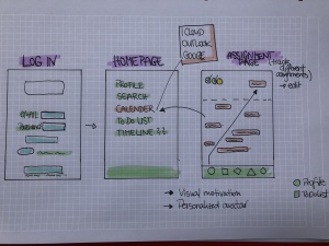
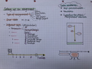
In doing that, we started by creating Sketches. Sketches are an easy and straightforward way to visualize ideas and they helped us build onto our ideas, bit by bit.
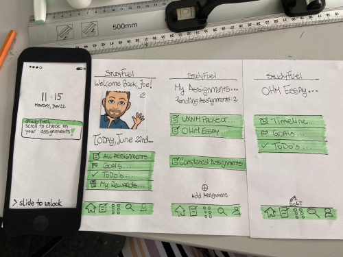
We started off by drawing how we wanted our app should look like. We came up with some ideas of the different pages and thought about the different requirements each page should meet and also how the different pages could be connected to each other.
To integrate the Must-Haves we came up with after doing the focus group interviews, we created a table for the planning of each section.
This planning table made it easier to design the different sections, except for the timeline part.
→ So we started thinking of a specific problem we want to solve and thought that we will find the solution in a paper prototype.
PAPER PROTOTYPE
To start creating the paper prototype we begun to put our requirements on paper by using every drawing equipment we could find.
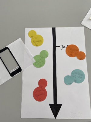
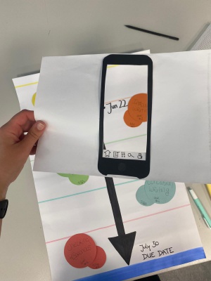
We wanted to generate a timeline like a map, where you are in and where you can walk through the different assignments.
The paper prototype we came up with was a walkthrough to make it a part of the Mobile Application and we built up the general looking of the app with the log-in page, the landing page, and the list of assignments.
GOAL OF THE PAPER PROTOTYPE:
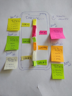
→ 3D timeline as an overview of all assignments and the different deadlines and ToDo´s a student has.
We built a 3D version of the timeline out of paper and we simulated the interactions it should have by using a separate sheet of paper in the shape of an iPhone.
PAPER PROTOTYPE TESTING
After finishing this paper prototype composed of the general app looking, we were not sure if this paper prototype meets our requirements.
To make that sure we quickly tested the paper prototype on one person, before we continued the whole process on paper prototyping.
The testing was necessary to make sure that the paper prototype operates in a way we expected and if the user will get the idea of the 3D version.
Also, the fact that we tested only a single person on our paper prototype was helpful to get feedback from an innocent person and to refresh our mind to focus again on the user needs and our main goal.
RESULTS OF THE PAPER PROTOTYPE TESTING:
- The subject was really impressed by what we created so far, and we were happy about that early evaluation.
- The person really liked the possibility to scroll through the timeline with all the different goals and the specific ToDo´s for each of the goals.
→ The paper prototype worked and was fully developed so that it was not necessary to improve it.
While we were working on our paper prototype, we got more and more familiar with our prototyping tool and we were able to build up the 3D version of our expected timeline in the mock-up.
We recognized that we were able to do everything we wanted to create through the designed mobile app.
We wanted to test two versions of the timelines a 2D version (a static version) and a 3D version of the timeline to compare both versions. Which this comparison we wanted to see which version students prefer to use.
Finally, we decided not to use the paper prototype for the final testing, because we were able to build up both of these versions on our mock-up.
Study Fuel Prototype
GOAL
To create two different digital prototypes, both incorporating our core ideas and findings of the contextual inquiry and the focus groups, but providing different types of timelines (interactive vs. plain) in order to use it for the upcoming user testings.
MOCKPLUS
For our digital prototype, we decided to use Mockplus, mainly because
- It gave us the most options to customize, which we thought was especially important for the design of our timelines
- We were able to make the prototype aesthetic, which was important according to our participants in the focus groups
- It provided the option to make the prototype interactive (click-through)
- We had the option to collaborate
TIMELINES
Our focus in the prototyping was the creation of the two different timelines: the interactive timeline and the plain timeline.
Interactive Timeline
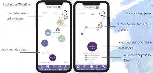
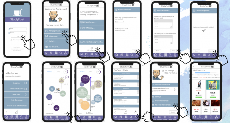
The interactive timeline was inspired by the game "Pokemon Go" where you can interactively "walk" along a pathway in a virtual world. We structured the assignment process by using milestones, which we visualized by using colored bubbles. Each bubble represented a milestone. By clicking on a milestone to do's for that particular milestone showed up. The user was then able to mark certain to do's as complete by using checkboxes.
On the pathway of the assignment process, the user could see their deadlines and due dates for certain milestones as well as their position in the process, portrayed by an icon of their profile picture. This way, the student could easily see which steps need to be taken next and how much work still needs to be done in order to complete the assignment. Additionally, in the upper right corner, a progress bar indicates in percentages how much of the assignment is completed already.
Also, there's an upper menu bar in which the user can switch to the timeline of another assignment, just by clicking on it.
Plain Timeline
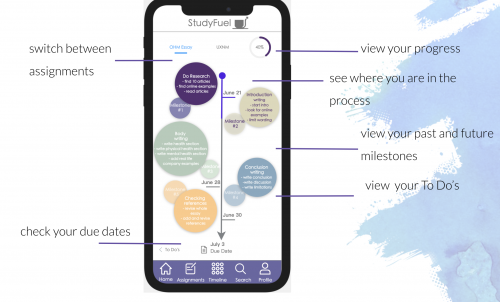
The plain timeline on the other hand was more a static overview of the whole assignment. We incorporated all the functions that we did in the interactive timeline, just in a different way and with almost no interactive elements. The user had as well the options to switch between assignments, check due dates, view the progress, and view your past and future milestones. However, the user was only able to view their to do's for particular milestones and not able to mark them as completed via the checkboxes.
Even though the design of the two different timelines was the main focus of the digital prototype, we also wanted to design the other pages of the prototype in order to incorporate the other findings of our contextual inquiry and focus groups, especially the anti-procrastination support and the rewards system.
Finally, we had two versions of the prototype. One included the interactive timeline while the other had the plain timeline incorporated. Both, however, included:
- A landing page on which the user could access their assignments, milestones, to-dos, and rewards.
- An assignment’s page with an overview of the ongoing assignments and the option to add a new assignment
- A milestone’s page including an overview of milestones for particular assignments
- Timelines showing the progress for ongoing assignments, designed as shown above
- A user profile providing the options to change settings concerning work and reward preferences
- A rewards page on which the user could redeem vouchers and discounts from certain brands as soon as a certain amount of milestones was achieved
The pages were connected with each other and accessible through the back- and forth-buttons. Further, we incorporated a bottom menu bar which provided the option to directly access the landing page, assignment’s page, timelines, and the user profile. We also incorporated a search-button which was not clickable but rather an indicator for another possible function in the future.
This link leads to a video of the prototype: Video of StudyFuel Prototype
Usability Testing
Initially, we wanted to compare the interactive and the plain timeline for their usability. For a better and more authentic comparison, we decided to use Mockplus for both versions. Creating a second version of the prototype, where only the timeline was different, made it possible to test for results which were not influenced by the material and mode the timeline was communicated in. Since our prototype was also functional when it came to other aspects of the app, we wanted to include using these parts of StudyFuel in the testing process as well. Similarly, we did this because we wanted our users to get the feel of our application as a whole, and not just the timeline sections that we were testing.
RESEARCH QUESTION
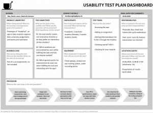
For having a clear focus in the testing, we developed the following questions:
- Do users prefer a plain, non-interactive or an interactive timeline?
- Which problems are encountered by users while fulfilling the task and how can they be tackled?
- Which general points for improvement do users see when fulfilling the task and interacting with the app?
METHOD
For our testing, we initially planned on doing two rounds of testing with six participants each, four Master and two Bachelor students. Unfortunately, two Master students did not show up. We still managed to have two rounds of testing, one Bachelor student and one Master student in each one. Furthermore, we planned using an eye-tracking-system for at least one of the users. This would have given us the chance to identify possible difficulties in understanding the two timelines. However, we could not manage to make it work. This was compensated by asking users to think out aloud and recording the screen and their faced and comments when using the app.
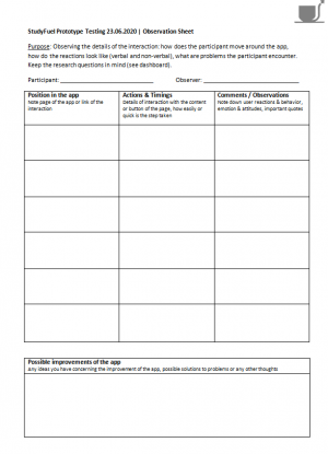
Since we did the testing physically, we could also observe our participants, their gestures and their emotional reactions directly and wrote down everything we noticed down on a pre-made observation sheet. By using a pre-prepared observation sheet, we tried to made sure that every participant was observed in the same manner. Vanessa and Laura, who were not physically present in the testing phase, watched the recordings of the test subjects subsequently, and nook notes. Thereby we made sure that we did not miss any points and had reliable results.
TASK
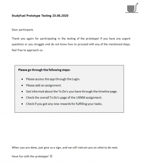
After filling in a consent form and receiving some basic information, the users got seated on their respective computers and each had to fulfil the same tasks:
- Accessing the app
- Adding an assignment
- Getting informed about the To Do’s through the timeline
- Checking overall ToDo’s
- Checking for new rewards
With having two people starting with the plain timeline version and the other two with the interactive one, we avoided possible skews. After they fulfilled the tasks with one version, the users had to fill out the AttrakDiff test. Then they switched the tab on the screen to the respective other version and filled in a questionnaire again afterwards.
Surely, people were faster when using the prototype the second time. Still, the time they had to spent for understanding the two different timeline versions gave us a good idea about the user-friendliness of each version. Based on our contextual inquiry results, one thing we aimed to do was to reduce cognitive load when people were planning their assignments. This was one important aspect that we wanted to assess when people used the app and made errors or encountered issues. With having a clear way of doing the tasks in mind, we could compare people's way of dealing with the tasks.
QUESTIONNAIRE
As was already stated, we used the AttrakDiff questionnaire to also have quantitative results. It offered a quick, free and easy way to assess the users likings.
HEURISTIC EVALUATION
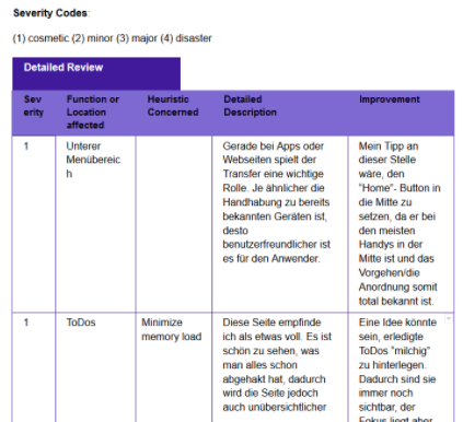
Besides the user testing, we also did a heuristic evaluation with a person we know working as a UX researcher. She was given access to the prototypes and the table, where she could note her thoughts and elaborate on our ideas.
Based on our contextual inquiry, we chose the following main criteria:
- Minimize memory load (the app should make the process of planning easier and relieving)
- Self-descriptiveness (timelines and ToDo sections should be straightforward to use)
- Error tolerance (there should be a clear way of how to navigate through the app and fulfilling tasks)
Testing Results
QUALITATIVE RESULTS
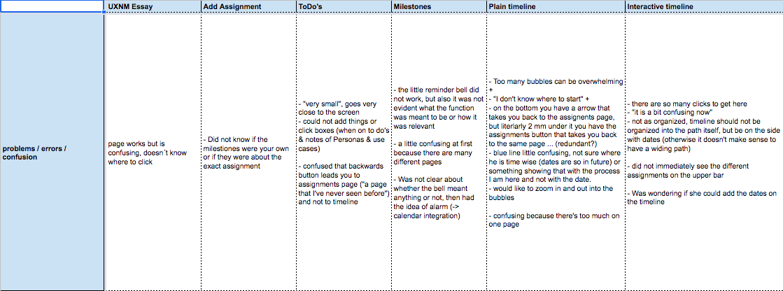
The qualitative results were gathered through a process of observation, thinking aloud, and video recording. In addition, once the videos of participants were looked through once more, an Excel sheet was created in order to write down important information that might have been missed during testing.
The Excel sheet consisted of all of the pages found in the prototype, which were classifiable through the following categories:
- Main actions taken
- General observations
- Problems / errors / confusion
- Feedback/ recommendations
- Quotes
These results offered the following conclusions:
- 4/4 participants stated that they would be interested in the App
- 3/4 participants preferred the interactive timeline
- 3/4 participants found the ToDo’s within the interactive timeline to be useful
- 4/4 participants found the rewards section very nice
- 4/4 participants mentioned that the process included too many clicks
- 4/4 participants asked about the connection of the App to their personal calendars
- 4/4 participants found the plain timeline to be confusing
Important quotes from participants:
"Once you get the hang of all the different parts, and field and wording of the app ... it is actually nice. It has a nice structure and a helpful overview."
"It can be applicable to work life as well, and other projects ... not just during my studies."
“If I have to choose, I would choose the interactive one. It's really nice that there's not too much on the page, so you can click the checkboxes and it's well structured.”
QUANTITATIVE RESULTS
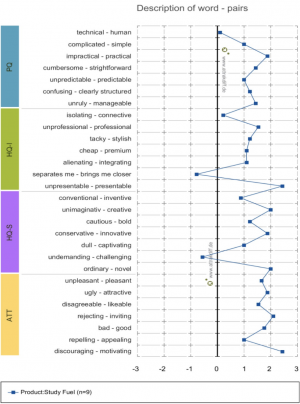
The survey AttrakDiff was utilized in order to assess the overall attractiveness of the App for the user
Once all results were gathered, we performed an Excel analysis to compare the means of plain and interactive timeline results
Criteria of survey:
Important differences:
Cumbersome - straightforward
Interactive (x̅ = 6.0)/ Plain (x̅ = 4.75)
Plain app is rated as more straightforward
Rejecting - inviting
Interactive (x̅ = 6.3)/ Plain (x̅ = 5.75)
Interactive app is rated as more inviting
Confusing - clearly structured
Interactive (x̅ = 6.0)/ Plain (x̅ = 5.5)
Plain app is rated as more confusing
Bold - cautious
Interactive (x̅ = 5.3)/ Plain (x̅ = 4.75)
Plain app is rated as more cautious
Dull - captivating
Interactive (x̅ = 5.3)/ Plain (x̅ = 5.75)
Plain app is rated as slightly more captivating
Only contradiction:
Plain app was classified as more straightforward, while it was also qualified as more confusing.
The apparent contradiction can be explained by the fact that the plain app has no interactions, it is simply an overview. Therefore, it more straightforward but, indeed, could be seen as confusing because of the amount of stimuli (e.g. too many bubbles, too many things to look at, not knowing whether to start from the bottom or the top).
HEURISTIC EVALUATION
We asked a UX specialist to go over our prototype in order to gain some extra insight into our application.
This evaluation was based on the following criteria:
- Minimize memory load
- Self-descriptiveness
- Error tolerance
Critical Assessment
The final testing of our platform was helpful and allowed us to see what we can work on, which functions we should refine, and it helped us to get new ideas from a different point of view.
IMPROVEMENTS
Testing:
During testing, even though things ran smoothly, we could have done the following things differently:
- Creation of two different surveys for the plain and the interactive timeline
- Usage of an eye-tracking device (technical difficulties)
- Increase the number of participants
Prototype:
Based on the aforementioned results of our testing, the following improvements should be implemented in the application:
- Provide a Help section & a tutorial for new users
- Reduce the number of clicks for users → fewer sections to search for
- Lower Menu area → place the Home button in the middle
- Interactive timeline → include dates in each bubble, not only on the path
- ToDo’s → an "area" that closes or is blurred out as soon as all tasks are completed
- Ability to sync assignments to your phone calendar
Conclusion
MAIN TAKEAWAYS
- Learning the process/efforts required to create an App with proper UX design
- Interacting with teammates in order to brainstorm and set ideas in motion
- Online focus groups and interviews worked way better than expected
- Utilizing a design Webpage in order to create what we had in mind
- Creating and recreating designs in order to meet the needs of interviews/focus groups responses
As a group, we felt that we succeeded in creating what we had in mind for our prototype. Users enjoyed testing the prototype and stated that it had potential.
Despite the changes that would need to be made to the prototype after our testing, this experience enriched our knowledge of UX design and its process.
FURTHER OUTLOOK
Our final prototype was interactive and represented our core ideas and findings of the contextual inquiry and focus groups. However, we have not yet implemented the findings from the user testings and found several possible improvements that one could implement in the future. If we invested more time and resources hereafter, it would provide the opportunity to build a high-fidelity prototype, including improved features and an elaborated, more intuitive user interface, letting the user fulfill their tasks with fewer clicks. In the near future, this could lead to a minimal viable product that could be further tested and continuously improved.
