Uni Platform (YoUNIgo)
Contents
Describe your project
The Project's Idea
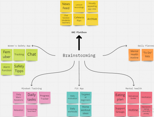
In order to come up with an idea for an app that would interest all of us, we started off with a brainstorming session where we discussed all possible routes. The ideas we came up with were diverse and ranged from a fitness app, a daily planner, to a women's safety app. All app ideas had some personal connection to us and we had ideas how we would improve them and the functions they would include.
To choose our final idea we all did market research into the different areas of the possible app development ideas. We investigated which apps were already out there and what new and innovative thing we could actually bring that did not already exist. In the process of this, we found out that some markets were already oversaturated, this was for example the case for fitness apps. We could not see what new features we could bring to the market and therefore excluded ideas one by one. On the other hand, there were app ideas where we had a vision and that interested us, but where we found it hard to specify our goal and substantiate which functions or targets the app would have, e.g. the women's safety app.
In the end, our decision was very clear and we decided on the idea of the student platform. There were several reasons for this:
- all group members had a personal connection to this idea and would be able to contribute
- we could relate to previous experiences and were thus already able to compare pros and cons of platforms
- we were all dissatisfied with the previous platforms we had encountered and therefore felt like there was room for improvement
- because of this we already had plenty of ideas for new functions, and a general vision of our app should look
- there was easy access to our target group of students which could be helpful in later stages for investigation purposes
The Project's Vision
Our vision is to establish a uni platform forming a hub for all tools a student might need, providing a holistic one-stop platform supporting students during the entire duration of their university career. The design will be intuitive and aesthetically pleasing, making it easy to use.
The platform aims to include functions such as a responsive timetable, canteen plans, support for job hunting, tools for students to collaborate and supplying learning materials.
We decided on a name for our app very early on, as it really encompassed the vision of our platform very well: yoUNIgo. The app is able to be used on the go and you are "ready" for university matters once you have used it.
The Project's Goal
A unviersity platform is a big part of a student's every day life. Many use it daily and it is an important point of contact with their university. A platform that does not work well causes unnecessary stress which could easily be avoided through a better-designed app. Creating an app like this also allows for a lot of creativity, there is a wealth of options we could include and it allows us to be innovative and have more freedom with our ideas.
Our goal is to create a platform that makes everyday university life easier for both lecturers and students. The app we create should be easy to use and cover all the needs of the students. For this purpose we would like to find out which advantages and disadvantages previous platforms have in order to design an ideal platform from this information.
Contextual Inquiry
Despite all of us having previous experience with university platforms, we still needed to find out how platforms currently work, how users are currently using them and the way they interact with them. In order to do this, we conducted a Contextual Inquiry and observed users in their natural context.
Preparation - Current Status of Uni Platforms
Before beginning the concrete planning of the CI we had to investigate what platforms already exist and what would be competitors or role models of ours. To achieve this we conducted research and asked other students what kind of platforms they were using. We found out that there were a range of different platforms, we chose four platforms to place our focus on.
Planning of the Contextual Inquiry
There are a wealth of different methods to complete this CI, we opted for an observation combined with a semi-structured interview. We wanted to observe students whilst naturally using the platform, but since there are some functions that might need to be prompted we decided to combine these. Through the observation we could find out what students use most and how they would use the platform on a normal day, and through the questions we would be able to gain a deeper understanding of how it is used and how functions work in specific. The questions also give an opportunity for general feedback to be given by students of what was well-liked and what did not work as well.
When planning the execution of the CI we considered some questions to ensure we were well-prepared and knew what we wanted to get out of conducting it.
Goals & objectives of our CI
- What tools do students really need?
- How and why do they use a university platform?
- Why do they use a platform and what do they want to get out of it?
- Advantages and Disadvantages of current platforms
- Which interface is most suitable and practical for students?
Contacting & recruiting participants:
- One to two students from HMKW to look at Trainex from their perspective
- Look at three other platforms and interview two to three student per platform to allow for comparison
- Recruiting through our own personal network, asking acquaintances and friends to participate
- Totalling 8-10 observations in total
When does activity occur & how can we observe it:
- Ask students to show platform and ask questions -> Combination of observation & interview
- Problem: difficult to show an app when completing the CI virtually
- We will solve this by using Zoom and asking participants to show us the desktop version
- Problem: some tasks are quite rare and only completed once a semester
- We will solve this by asking participants if there are any functions they rarely use and prompting some, e.g. showing of grades
- Aiming to complete sessions within thirty to fourty minutes as time spent on platforms is usually very short
Interview Guidance & Procedure
We have created a procedure to follow for all of our observations.
All interviews were conducted on Zoom, participants shared their screen and the sessions were recorded with their permission. We also took notes about what participants were telling us during the session.
Introduction
"We are HMKW students and are aiming to develop a new student platform as part of our studies. As part of this we are currently looking at what kind of platforms already exist. That's why we would like to ask you to show us your university platform today. Everything that we discuss today will of course be treated confidentially and will only be discussed in the context of our group.”
1.1 Would it be okay with you if we record our meeting today?
Procedure
"We would like to see what you are doing on the platform and how you perform certain tasks."
2.1 What do you do most often/what is the first thing you do after you open the website?
2.2 How can you register / log in to this platform? (Do you need multiple passwords / usernames (Olat, Ilias))
2.3 Show me how you can access your timetable?
2.4 Can you show me where you can find the slides from your last lecture? Is there an archive?
2.5 Are there functions that you use less often or only for certain purposes? purposes?
2.6 Where can you view your exam results / grades?
2.7.How can you get in touch with your professors and fellow students?
2.8 How often do you use the platform and for how long do those sessions last? In what way and manner?
2.9 Would you say that you are satisfied with the functions of the platform?
2.10 What do you like and dislike about the platform? What functions do you miss?
2.11 If you had the opportunity to change or improve something about this function, what would it be?
2.12 What does the platform do in your words? Can you briefly summarise in a few sentences? What is missing?
End
"Thank you very much for your participation and the time you took, we are very grateful for the insight you gave us! If you are interested in the results of our project, we would be happy to provide you with the final results of our project. Do you have any feedback for us or any further questions?"
Interpretation
In total, eight interviews and observations covering four different platforms were conducted with current students, all over Zoom. Using the interview guildeline these lasted from 25 to 40 minutes. Some notes about answers to questions were taken during the interview and recordings are used for supplementary information.
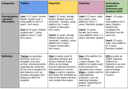
For an initial interpretation, we created a table to collect our results in a structured manner, seperating them thematically and by function of the platform. For the creation we used the interview guideline to steer our categories. All results were input here, providing us with a good and deep initial overview of our findings about the different platforms.
As interviews were conducted individually, we first presented our initial results to the group. In order to ensure consistency, objectivity and not to miss any information, one other team member then viewed each recording, and if appropriate the second observer added information accordingly.
We collated our results into a table in order to capture our findings. This is an extract of what the table looks like:
All participants were Master or Bachelor students in the age of 22 to 24 and tech-savvy.
Once all information had been collated, we looked for common themes and tried to summarise our findings as a group. This was done by comparing platforms and what our participants had stated about a function, for example the timetable.
We also considered user profiles such as the time and frequency of use to aid in the creation of personas later on.
Once the summary had taken place we were left with a better idea of what platforms currently do, what students like about them and how they could be improved.
Results
Ideas
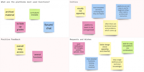
The interviews we conducted with students found that most student platforms are unorganised and confusing, visually not appealing, have technical problems and are not easily usable for beginners.
On the positive side, most of the platforms provide an easy access to different functions such as a canteen menu, timetables and access to lecture and learning materials.
From the criticism and feedback from the platforms we could deduce the following tools that are important to students:
- Push notifications for changes of timetable or new uploaded grades
- One platform encompassing all tools in the form of an app, not seperate platform for different functions
- Visually appealing and easy to use
- Most used tools: timetable, grades, forums, chat and lecture archive
Personas
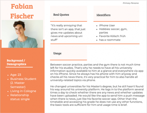
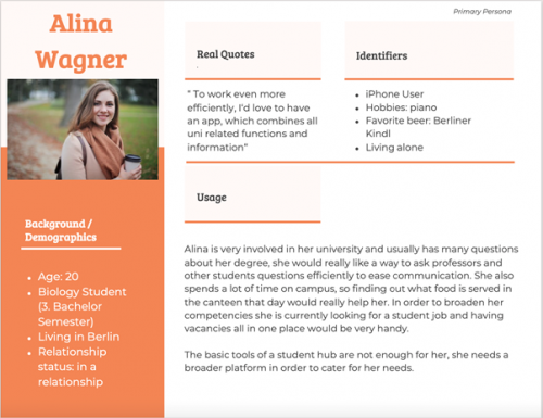
Creating personas gives representative users a face and helps us as a team empathise with future users. They can be a "touchpoint when a question of concern arises of how aspects of the project should be designed" (Unger & Chandler, 2012).
As a result of our Contextual Inquiry we therefore created two personas which represent our user target group, Fabian and Alina. To make the personas as representative and realistic as possible, we used the information derived from our CI combined with ficitional information.
We focused on different content requirements for personas. We decided on natural photos to represent the personas as these would be more relatable and added names, hobbies and lifestyle as this would humanise them. Their age and occupation was important to us as they would be part of our target group. We chose two locations of big cities which have several universities, this would also demonstrate that our platform is universally applicable in the whole of Germany. Additional content such as a personal quote also made them more believable. Their level of technical comfort would be important for app development too.
Non-personas who will be using the app but whose needs we will not consider in the development of the app are those of professors working at the university as well as the university admin staff.
Scenarios
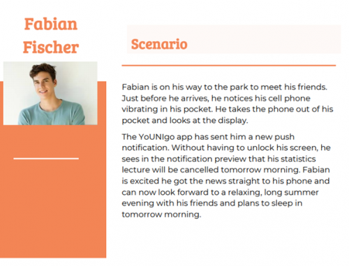
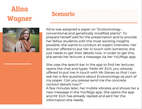
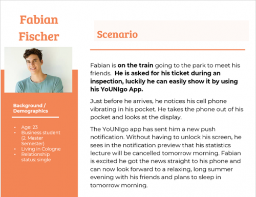
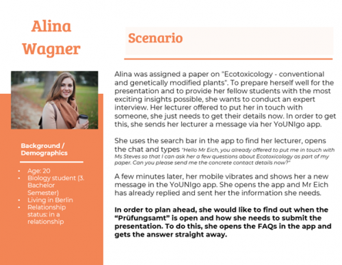
Scenarios are important to imagine the usage of the app in a specific and everyday situation. It helps understanding how and in what context a person would use the app in real life, what points we should focus on in the further UX design process and what the main needs and motivations of our users would be in the future (Szerovay, 2017).
Resulting from the developed and found personas, the following scenarios can be worked out:
Reflection
Once we had completed our Contextual Inquiry we reflected on how the methods we had used had worked for us and what kind of take-aways we could use.
- + we gained interesting and new insights that will help us in the development of the app
- + the virtual context worked very well, users could share their screen and we could see exactly what they see, it was not a hinderance that we could not conduct interviews in person
- + the questionnaire worked well to gain all information we needed, nothing was missed out on and it allowed for comparison between the different platforms, making the analysis easier
- - next time we would conduct the interviews in pairs, it proved difficult to take notes at the same time and all recordings had to be rewatched by another researcher regardless, so the same amount of time would have been spent
- - our sample of people we interviewed was not very diverse, next time we could aim to look at more different kind of users, e.g. more different ages and courses
Focus Group
Our goal was to gain detailed insights of what students want from a new university app. We specifically wanted to find out what functions they would like, how the app should be designed and how they would like to receive push notifications from it. In order to gain this information we conducted a focus group with participants who are currently students.
Method to structure the focus group
In the process of planning the focus group we compared different methods of structuring the session. To us, it was particularly important that we would enable participants to come up with novel ideas and thus we as moderators would have to encourage creativity. However, we did not just want a long list of possible ideas but also concrete plans on how we could implement them into our app. During our research we decided the Disney method was the most approrpiate for this purpose. This is a collaborative creativity technique which guides participants through three different phases (Tausch, Steinberger & Hußmann, 2015).
We chose this method because it gives us the opportunity to go beyond our previous similar ideas within our group and the participants are asked to expand on them with creative ideas and suggestions. So this technique was the best fit as it encourages participants to adopt different thinking styles to approach finding and developing new ideas. Another appeal of using the Disney method was the fact it encourages participants to be creative and bold with their ideas whilst also critically evaluating these in a later stage and making concrete, achievable plans later on. This would enable us to go deeper than simply collecting ideas, and make it more realistic for the ideas to be included in the app design later on.
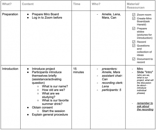
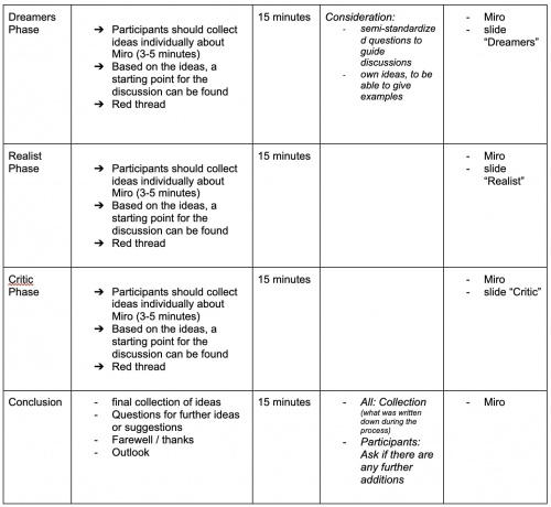
To help us plan our focus group, we created a schedule to plan timings and the general procedure:
Participants
The only requirement for attendees was to be a current student as we felt like they could best judge the needs for the app we are developing.
Recruitement took place through asking friends, acquaintances and fellow students to participate. In advance they were only told that we are looking for participants for a focus group for a university project concerning an app for students.
In order to get a range of perspectives we aimed to recruit a diverse mix of genders, degrees and universities.
For the focus group the group was made up as below:
Moderators: 2
Observers: 2
Participants: 5
Duration: 1h 10 Min
Age: 23-26
Gender: 3 Men and 2 Women
Procedure & Activities
Two group members took on the role of the moderator whilst the other two members were note-takers and observed. The focus group took place in German and was conducted over the video conferencing tool Zoom.
In preperation of the focus group we established a clear agenda as well as a script for the moderators. The procedure was as follows:
I. Part: Introduction
- Introduction of our project group
- Ice-Breaker Questions:
- Please introduce yourself
- How old are you and what do you study?
- What is your go-to drink in the summertime?
Once everyone had introduced themselves we explained our project and the purpose of this focus group. We also asked the participants for permission to record the session for further analysis to which all participants consented.
The moderator then started the group by outlining the agenda of the following discussion so attendees would know what to expect next.
II. Part: Disney Method
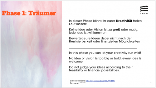
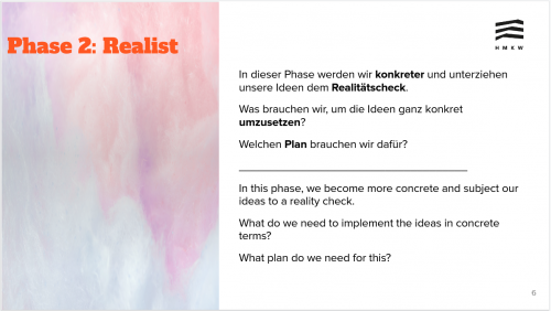
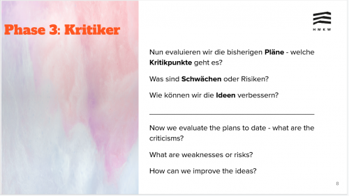
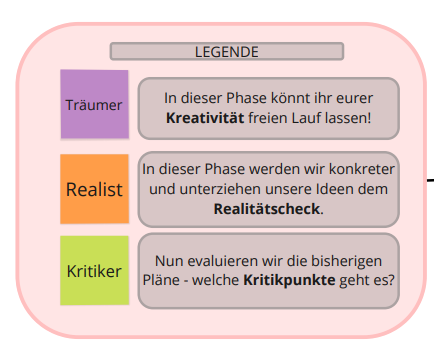
The Disney Method is one of many tools that can be used to structure a focus group discussion. It requires participants to take on different roles in three different phases. This method incorporates the Dreamer Phase, the Realist Phase, and the Critic Phase. Instructions for each phase were given verbally as well as on a powerpoint slide so participants could continuously refer to it. Ideas were collected on a Miro board which allowed participants to work collaboratively and see what others were noting down in real time.
In each phase, attendees were first given three to five minutes in quiet to collect their initial ideas on a Miro board. This was to encourage participation from all members and to ensure everyone had time to think about ideas to come up with. Once they had been noted on the Miro board these ideas were then discussed as a group to allow people to elaborate on their ideas as well as facilitating a group discussion. We planned to spend around 15 minutes in each phase.
Dreamers Phase
In this phase we asked all participants to take on the role of a dreamer and think about what they would like a university app to look like if there were no boundaries. This encourages attendees to think outside the box, not be scared by stating any ideas and simply brainstorm. We specficially instructed them not to evaluate their ideas based on practical feasability or financial possibilities and that any and every idea was welcome in this phase.
Realist Phase
We then moved on into the next phase of the role of the Realist. Participants were now asked to become more concrete with their ideas and think about how an idea would be implemented and what the specifics of a function would be. The ideas were subjected to a reality check and elaborated further, pragmatic thinking is encouraged.
Critics Phase
In the final phase the plans made thus far were evaluated and critically considered. We specifically asked participants to think about strengths and weaknesses of the ideas we had collected together. Suggestions for improvement of existing ideas are sought and possible obstacles that could be faced in reality were also collected.
III. Outro & Farewell
We first asked whether there were any suggestions or unanswered questions remaining they felt unable to mention before. Participants were also offered the opportunity to obtain a credit for taking part in our study.
The focus group was concluded by thanking participants for their time and valuable contribution to the project as well as offering to share our results once the project is finished.
Findings
After the focus group we had a wealth of information to analyse. There was the Miro board that had been developed throughout the course of the focus group, notes that had been taken by our note-takers as well as a recording of the session as a back-up. We proceeded to sort the results into cateogries in order to draw conclusions from them.
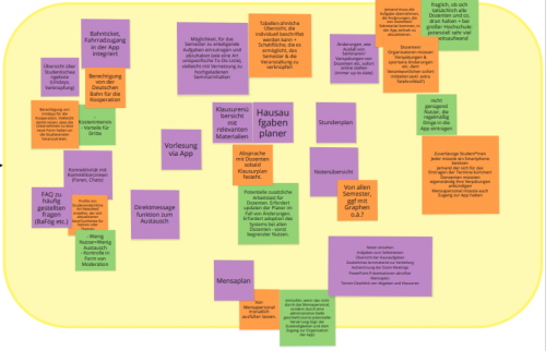
I. Look of the Miro Board once the session had finished:
II. Most common themes:
- Organizational
- Studyplan
- Grades
- Update on spontaneous changes (e.g. cancellations or delays)
- Homework Planner
- Exam overview
- Features / Cooperation with other companies
- Train ticket (maybe with a discounts) and bike access
- Link to Unidays and overview of their offerings
- FAQs
- Mensaplan
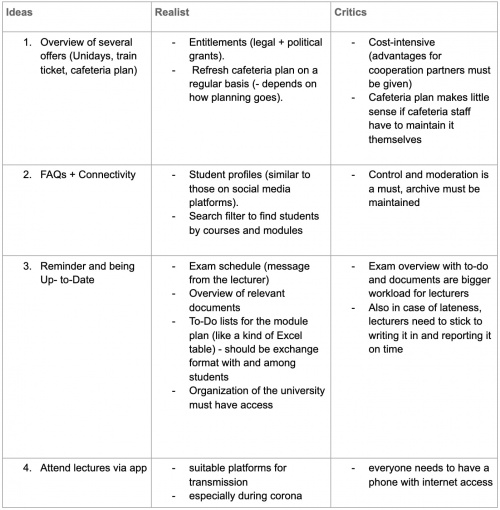
III. Extracted, categorized and summarized results of the focus group:
Some functions that attendees suggested were already on our radar from the Contextual Inquiry we had performed earlier on, for example notifications from changes in the timetable. These suggestions were not surprising but affirmed that including this function should be a priority when developing our app.
On the other hand, there were some functions suggested that we had not previously considered, like including other student-specific functions, e.g. a Semesterticket. Therefore the focus group gave us valuable inspiration and new input to work with.
Reflection
After the focus group, we reflected on how the session went and how we would do things differently next time.
Overall, we felt like we had well prepared for the focus group and were very happy with the outcome.
- + our roles were clearly split, helping with the coordination of the session and giving participants clarity
- + the ice breaker was well-received and helped engage participants in the discussion
- + we met our goal of gaining new ideas and thus were happy with the outcome
- + the use of Miro was the appropriate tool to use and all attendees were able to use it without issues, it allowed the session to be interactive
- - conducting the session online proved to have some difficulties that came with it
- - we wished there had been more of a discussion and back and forth between attendees, our moderator had to encourage this quite heavily and had to summarise frequently
- - participants had to actively be asked to elaborate on ideas and sometimes there were moments of silence
Perhaps a method other than the disney method could have encouraged this loose and casual discussion, where phases are not as rigid and we would consider this for any future focus groups we conduct.
Modelling
User Stories
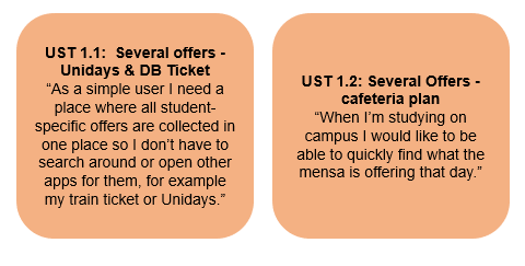
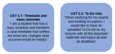
Based on the research we had done thus far, we created several user stories based on a variety of functions. These user stories are written from the perspective of a future user and show in a very succinct manner what our users aim to accomplish by using our app and will serve to remind us of users' goals during the coming design process. They ensure that the user is at the forefront of design decisions at all times and are therefore an important and also humanizing part of the design process (Jane, 2019).
Use Cases
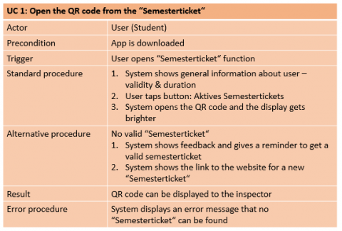
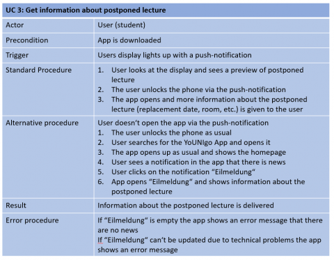
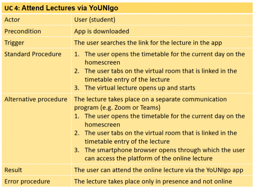
Use cases become more concrete than user stories and describe a specific task that is to be completed by the app later on. There is always a specific goal the user would like to be achieved and a sequence of steps between the actor and the system is described. This forces the researcher to think about specifics and factors such as preconditions of the task and will help us later on in the development of the yoUNIgo app.
Updated Scenarios
As a result of putting together our use cases and stories we also reviewed our scenario that we had previously put together after the contextual inquiry. We still found it largely to be true and matching with our results, meaning we were still going in the right direction.
There were some slight adaptations made to account for new functions that were asked for by users, these are marked in bold.
Next steps & Outlook
For the beginning of the next semester, we plan to start thinking about the design of our app and start the protyping process. We hope that it will be possible to meet in person again by then and would like to start with a paper prototype. If that is not possible, we would start the process using a digital prototyping program - but have not yet settled on a specific one.
We also have not completely decided on specific features of the app we want to create as a prototype. However, we will be guided by the main findings and wishes from our focus group. Once a first prototype is in place we would start testing and evaluating and then repeat the processes again.
Prototyping
Planning
Bearing in mind the results from last semester we began to plan our prototype.
Generally, we decided to do a horizontal prototype. We were aiming to prototype a lot of functions and how the navigation through the app would work, but not in as much depth.
It was especially important to us to have a consistent and aesthetic look and feel of the app.
We then decided what functions we wanted to prototype and which we would not further include in the app:
Our ideas for more engagement
When creating our prototype we also considered ideas for more engagement according to the antecedents of engagement of O'Brien & McKay (2018).
Aesthetics: The overall visual appeal in the app is very important. At first glance the student should like the platform and want to use it. We will keep aesthetics in mind with every design decision we take and also place a focus on this in the testing. Our target group of students has to like the look and feel of the app!
Content: Interestingness. Only content that is relevant to the specific student should be shown to them. Content should therefore be sorted by what course they are enrolled in or by personal preference settings. Posts by fellow students might increase engagement as relevance is higher
Media: if technologically possible include sensory components. Features like sounds where students can be interactive and feel involved might achieve higher engagement
Finding the right plattform
To design the prototype, we looked at various platforms. We were particularly interested in the Miro and uizard platforms. In the end, we decided to use the platform Uizard because it offers some advantages in our eyes.
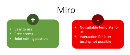
Pros & Cons Miro
Pros & Cons Uizard
Since the advantages of the Uizard platform were clearly superior to those of Miro in our eyes, we decided to use this platform. We were able to access some useful templates, images and icons that made it easier for us to create the prototype. The few disadvantages of the platform became apparent during the creation process. We quickly realized that the 10 slides of the free version were not enough. So we decided to book a paid upgrade to get access to more slides. However, this access could then only be used by one user. Since we were almost done with the prototype at that time and only some minor adjustments had to be made, this was a good compromise for us.
Heuristic Evaluation
To get some initial feedback on our prototype, we conducted a heuristic evaluation with the other project group.
In preparation, we put together a testing package for the others. This contained:
- A short introduction and the link to our prototype
- Heuristics we wanted to investigate
- 2 scenarios
- A table for the feedback
Heuristics
Our focus for the heuristic evaluation was on 3 different heuristics.
Speak the user's language: Use words, phrases, and concepts familiar to the user, rather than internal jargon. Follow real-world conventions, making information appear in a natural and logical order.
Self-descriptiveness: Users realize what they can do with it, and how they can do it. At any time, users are aware of what is happening and how to interact with the object or interface.
Conformity with user expectations: A dialog is expectation-compliant if it meets user concerns that can be foreseen from the context of use as well as generally accepted conventions.
Scenarios for testing
We created 2 scenarios that were relevant to the other group. Since the focus for us with the app was on the "chat" and "timetable" areas, the scenarios covered these areas and were meant to guide the testers specifically to these areas.
The scenarios were as follows:
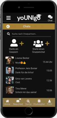
Scenario 1: You have been assigned a presentation with your course mate Louisa. However, during the lecture you did not get a chance to talk about how you will distribute tasks. Through the yoUNIgo app, try and get in touch with Louisa to discuss the presentation with her.
Scenario 2: You got a push notification letting you know that a lecture tomorrow has been cancelled. Try and find out which lecture has been cancelled.
Feedback
In the following table we have recorded the feedback of the heuristic evaluation:
* (1) Cosmetic problem (2) Minor Usability-Problem (3) Major Usability-Problem (4) Usability Disaster
Implementation of the Feedback
After the other group had shown and explained their findings to us, we went back to our prototype and made a few changes. Some of the feedback points did not need to be incorporated because they were only minor errors in our English prototype and were partly due to translation. Our primary german prototype did not contain these errors.
What we did adjust, however, are the following issues:
- To-Do List: We redesigned the check box to make it more self-explanatory - we also reworked the overall design of the To Do list a bit more.
- Timetable:We've redesigned the "Cancelled" display and also changed the font color so it's easier to read
- Chat: We placed the function in a more concise place in the app
- Mealplan on the home page: we redesigned the home page, gave more space to the To Do list and removed the Mealplan from the home page instead
- Icons in the menu: The icons were misleading, we removed them to avoid confusion
Usability Testing
To gain further insight and feedback on our prototype, we conducted usability testing within the target group relevant to us.
We decided to conduct qualitative interviews for this purpose, as this allowed us to better observe the use of the app and to better query the thoughts and feelings of the test subjects.
For this purpose, we created an interview guide in advance to be able to draw better comparisons between the different interviews at the end.
Procedure of the interviews / structure of the interviews
In the context of the testing we chose the method "Thinking out loud", because it allows the subjects to speak out loud all the passages and thoughts during the processing of the prototype. By doing this, we hoped to better understand what was going through the participants' minds while using it and obtain deeper insights.
After welcoming the participants, we explained the thinking out loud method and asked them to share their thoughts with us during the following processing of the prototype. We explained that we would like to be able to understand their thoughts and to share whatever was going through their mind whilst clicking through.
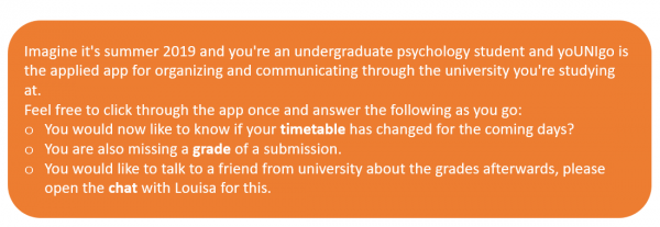
Before we sent participants the link to the prototype, we also read the chosen scenario to the subjects:
Afterwards, we asked the participants to open the prototype and search for the information from the scenario.
In case the participants got stuck or had stopped sharing their thoughts according to the Thinking-Out-Loud Method, we had thought of the following questions/suggestions in advance to encourage progression and hear their thoughts again for later analysis:
- What is going through their minds right now?
- Are you finding your way around?
- Can I help you?
- Do you need some food for thought?
- Do you understand what you are looking for?
- Do you understand how to search?
- Is the logical flow clear?
These were to be asked if subjects were silent for an extended period of time or noticeably overwhelmed.
In addition, subjects were asked a few more questions after the run-through:
1. Usability:
- How well were you able to find your way around the app?
- To what extent was the given task achievable?
- How logical do you think the tabs and buttons are?
- How much did you have to concentrate to use it?
- Are there any difficulties you would like to mention in the follow-up?
- Are there any other comments or even positive feedback to the app?
2. UX:
- How logical and sensible does the walkthrough seem to you?
- How easy is the app to use?
- How intuitive were you able to use the app?
3. Design:
- Please rate the extent to which you think the design is appropriate.
- Are there things you would change about this design yourself?
- How would you arrange things to make them clearer and more distinct?
Participants
For our usability testing, we had a total of 6 participants. Of these, x were male and x were female.
All subjects were currently enrolled students and thus matched our target group.
Some of the subjects were also interviewed last semester during Contextual Inquiry. At that time, the students showed us their current university platforms. We were happy to involve these subjects again and show them the progress of our project and also show how you and the information from the past interviews helped us.
Results
In order to evaluate and structure the results of our interviews, we have classified them into a table using categories. In forming the categories, we were guided by our original research question and therefore structured the answers as follows:
- Timetable
- Grade
- Chat
- Newsfeed
- Usability
- User Experience (UX)
- Design
- Problems and criticism
- Positive aspects
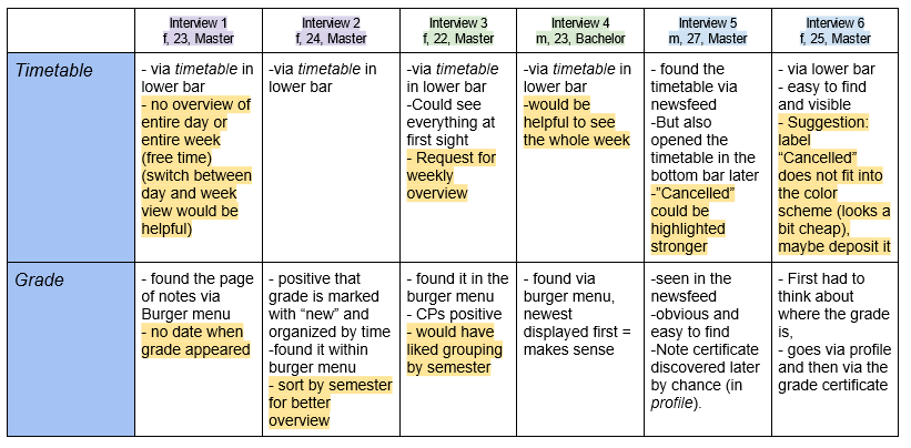
Here you can see an exemplary section of the created table:
In order to highlight where the participants had suggestions for improvement or encountered problems, we have marked these aspects in color. From this, new starting points for optimizing our prototype emerged.
For the purpose of quality assurance, we also took a second look at random samples of the recordings of individual interviews and filtered out helpful and relevant quotes.
Suggested improvements and changes at a glance
Timetable
- Weekly view desired by 3 participants
- "Not applicable" message to be highlighted more and adapted to the color scheme (2 participants)
Grade
- Grouping by semester desired (2 participants)
- Add publication date
Chat
- Group chat feature desired (2 participants)
- Unsure if chat would be used at all
- Especially to conntact lecturers
- Idea: swap search button and chat button
Newsfeed
- individual widgets to design the start page
- Newsfeed as start page
Usability
- Button for settings missing (3 participants)
- Designation archive unclear (4 participants)
- Certificates not intuitive in profile (maybe own tab in menu)
Problems and criticism
- Documents from the archive also accessible via laptop?
- Sort archive by semester
- To Dos unclear that you can design yourself
Usability Testing - critical reflection
What went well?
- We gained many valuable insights to improve our prototype
- Thinking out loud method worked really well – we generated in depth insights
- We were well prepared with our guideline – that helped by structuring the results
- Virtual data collection worked well
What could have gone better? What to improve for the next testing?
- Perhaps too many questions were asked, these could have been condensed into fewer
- We could have recruited some more participants to gain more insight and confirm results further
Impressions of our Prototype
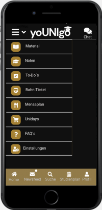
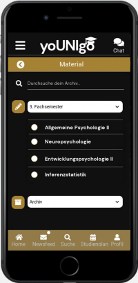
To get a better impression of our prototype, here are some screenshots. These were taken after the final changes from the usability testing.
Outlook & Next steps
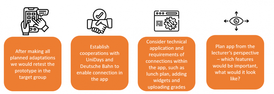
Once the usability testing and the adaptations had taken place we also thought about what could be done with YoUNIgo in the future.
References
Jane, C. (2019). How to write meaningful user stories. UX Collective. Retrieved from https://uxdesign.cc/how-to-write-meaningful-user-stories-3bcb1d51ff
O’Brien, H. L., & McKay, J. (2018). Modeling antecedents of user engagement. The handbook of communication engagement, 73.
Unger, R., & Chandler, C. (2012). A Project Guide to UX Design: For user experience designers in the field or in the making. New Riders.
Szerovay, K. (2017). Scenarios. UX Knowledge Base Sketch. Retrieved from https://uxknowledgebase.com/scenarios-43e05671b07
Tausch, S., Steinberger, F., & Hußmann, H. (2015). Thinking like disney: Supporting the disney method using ambient feedback based on group performance. IFIP Conference on Human-Computer Interaction (pp. 614-621). Springer, Cham.
